Understanding Icons: A Comprehensive Overview
In today’s digital landscape, icons play a pivotal role in enhancing design and usability. Far from mere aesthetics, these small graphics serve as visual shortcuts, facilitating communication and navigation for users across various platforms. An effective icon strategy can significantly improve user experience and bolster brand identity. For designers and developers looking to create compelling visual content, understanding the intricacies of icons is essential.
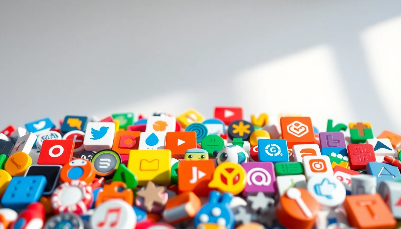
The Importance of Icons in Modern Design
Icons are indispensable in modern design due to their ability to convey complex information swiftly. As visual elements, they transcend language barriers, allowing for immediate understanding. A well-designed icon can enhance usability and ensure that users can navigate an interface intuitively, making it an essential component in websites, applications, and various digital products.
Moreover, icons simplify tasks. For instance, users can quickly recognize functions like ‘play,’ ‘pause,’ or ‘download’ through universally recognized symbols. This efficiency not only saves time but also enhances the overall satisfaction of the user experience.
Types of Icons: Which One to Use?
When it comes to selecting icons, understanding the various types available can guide effective implementation. The most common types include:
- Action Icons: Symbols that represent actions (e.g., trash can for delete, pencil for edit).
- Navigation Icons: Used for guiding users through an interface (e.g., home, search, arrows).
- Social Media Icons: Represent social platforms, typically found in footer links.
- Brand Icons: Logos or marks that signify company identity.
- Informational Icons: Icons that convey specific data or messages (e.g., notifications or alerts).
The choice of icon should depend on its context and the audience. It’s crucial to ensure it aligns with established conventions and user expectations to prevent confusion.
Creating Your Own Icons: Best Practices
Designing custom icons can be a rewarding endeavor, but developers and designers must adhere to best practices to ensure effectiveness. Here are critical guidelines:
- Simplicity: Strive for minimalism. The best icons are simple and easily identifiable.
- Consistency: Use consistent design styles across your icon set to maintain a cohesive look.
- Scalability: Icon designs must be clear and recognizable at various sizes, from small buttons to large displays.
- Test for Recognition: Before finalizing designs, conduct user testing to gather feedback on recognizability and preferences.
Design Principles for Effective Iconography
Color Theory in Icon Design
The color palette used in icons can influence user perception and interaction. Colors evoke emotions and responses, thus playing a vital role in icon design. Designers should consider the following:
- Contrast: Ensure there is enough contrast for visibility, especially on various backgrounds.
- Color Psychology: Utilize colors that align with the message the icon conveys. For example, red can denote warning, while green may signify success or safety.
- Brand Alignment: Icons should reflect the brand’s color scheme to create a unified design language.
Choosing the Right Style for Your Icons
Different styles can evoke different feelings and perceptions. When selecting a style, consider your audience and purpose:
- Flat Icons: These are minimalistic and modern, often used in contemporary applications.
- Outline Icons: Featuring only the outline, they are visually lightweight and versatile.
- 3D Icons: These icons provide depth and are often used in gaming and entertainment applications.
- Filled Icons: These offer a bold appearance, making them effective for communicative purposes.
Assessing the context and intended message can help in selecting the style that resonates best with the target audience.
Common Mistakes to Avoid in Icon Creation
Even the most experienced designers can fall into pitfalls when creating icons. Below are some common mistakes to avoid:
- Overcomplicating Designs: Intricate designs can confuse users and lose their intended message.
- Neglecting Size Dynamics: Icons must be effective in both small and large sizes. Always visualize the icon at various scales.
- Ignoring User Feedback: Feedback is crucial in the design process. Regularly testing designs with users can prevent missteps.
- Inconsistencies with Platform Guidelines: Each platform may have specific guidelines that need to be followed for UX integrity.
Utilizing Icons in User Experience Design
Icons as Navigation Tools
Icons significantly enhance navigation across interfaces, acting as visual landmarks. They can simplify the user’s journey through apps and websites. For example, a clear home icon allows users to return to the main page swiftly, while social media icons in the footer provide quick access to external platforms.
Implementing intuitive icons for navigation can lead to higher engagement and user satisfaction. Keep navigation icons consistent in style and connotation across different contexts to foster a smoother experience.
Enhancing User Engagement with Icons
Incorporating engaging iconography can result in higher interaction rates. By utilizing animated icons or icons that change states (for example, a heart icon that fills when liked), designers can create a dynamic interaction experience. These engaging elements not only attract attention but can also enhance the storytelling aspect of a design.
Moreover, consistent icon usage can foster familiarity, leading to increased trust and user retention. A study by Nielsen Norman Group found that engaging visual elements could improve task completion rates in applications.
The Role of Icons in Brand Identity
Icons can serve as a powerful representation of a brand’s values and ethos. When designed with intention, they can communicate the essence of your brand quickly and effectively. Think of how the Nike swoosh or Apple’s apple icon is closely tied to the brands themselves.
Incorporating distinctive icons into branding not only aids recognition across various platforms but can also enhance memorability and emotional connection with the audience. Therefore, aligning icon design with brand identity is essential for creating a cohesive experience.
Icon Libraries and Resources
Top Free Icon Resources for Designers
Designers looking for quality icons can turn to several resources that offer free icons:
- Flaticon: With over 18 million icons, this resource offers a variety of styles and formats.
- Icons8: This site provides a plethora of icons in several formats, including animated options.
- Noun Project: A community-driven platform where designers can contribute and download a vast array of icons.
- Freepik: Offers free vectors, illustrations, and icons, perfect for various design projects.
Utilizing these resources can save time and provide a jump-off point for designers looking to enhance their projects without extensive costs.
Paid Icon Services: When to Invest?
While free icons can be beneficial, investing in premium icon libraries can pay off significantly in the long run. Paid libraries often provide:
- Exclusive Icons: Unique designs that set your project apart from others using similar free resources.
- Higher Quality: Premium icons generally come in high resolutions or various formats suitable for professional use.
- Customization Options: Paid services often provide tools for modifying icons to better suit your brand or project needs.
In instances where brand representation is crucial, investing in quality iconography is a worthwhile consideration.
How to Customize Icons from Libraries
Customizing icons is a great way to ensure they accurately reflect your project or brand identity. Here are steps to effectively customize icons:
- Select the Right Icon: Choose an icon that closely aligns with your needs before customizing it.
- Use Design Software: Employ software like Adobe Illustrator or Figma to make modifications.
- Change Colors and Sizes: Adapt colors and sizes to match your brand’s color palette and design style.
- Add Unique Features: Implement elements that differentiate your icon from its original design while ensuring recognizability.
This can help maintain a distinctive brand presence while utilizing existing design resources.
Future Trends in Icon Design
Emerging Styles and Design Trends for Icons
The world of icon design is constantly evolving. Some emerging trends include:
- Neumorphism: A soft, embossed aesthetic that creates a sense of depth and tactile response.
- Gradient Icons: Utilizing gradients for a more dynamic and colorful appearance.
- Customizable Icons: Allowing users to tweak icon colors or shapes to match personal preferences and accessibility needs.
Staying updated with these trends ensures that designers can produce relevant and engaging content that resonates with contemporary audiences.
Impact of Technology on Icon Design
As technology advances, so too does the capacity for creativity in icon design. Technologies like 3D modeling and augmented reality are revolutionizing how icons are conceptualized and utilized. 3D icons can provide interactive elements that significantly enhance user engagement, especially in gaming and virtual interfaces. Moreover, AI-driven design tools are streamlining the creation process, allowing for faster production without compromising quality.
Sustainability in Icon Production and Use
With the growing emphasis on sustainability in design, icons are also experiencing a shift. Designers are considering the environmental impact of their creations and opting for eco-friendly design practices. This includes creating simpler, lightweight icons that require less data and energy during transmission. Furthermore, using designs that promote eco-conscious branding can resonate better with modern users who prioritize sustainability.